Web
Mobile
App
T-Mobile’s eSIM e-commerce experience
T-Mobile’s eSIM e-commerce experience
Before the launch of the iPhone 14, the first iPhone to support eSIM-only activation, T-Mobile’s eSIM onboarding experience faced significant adoption challenges. Many users abandoned the process due to unclear instructions, fragmented flows, and confusion around the technology itself.
This project focused on increasing awareness of eSIM, reducing friction during BYOD and new purchase flows, and improving completion rates for SIM activations. By collaborating closely with a senior designer, our copywriter, the research team, and the product owner, we redesigned critical touchpoints to make eSIM activations intuitive and accessible.
The results were measurable: eSIM awareness rose by 50 percent, customer adoption increased by 75 percent, satisfaction with SIM features reached 81 percent, and activations themselves saw an 87 percent boost.
Definitions
eSIM — A digital SIM built into a device, enabling users to activate a cellular plan without needing a physical SIM card.
SIM Swapping — The process of moving an active line between a physical SIM card and an eSIM, or vice versa.
MyTMO — T-Mobile’s signed-in account experience, where users manage their plans, devices, and account settings.
BYOD (Bring Your Own Device) — When a customer activates their personal device on T-Mobile’s network.
Purchase — When a new customer buys a phone and signs up for service with T-Mobile.
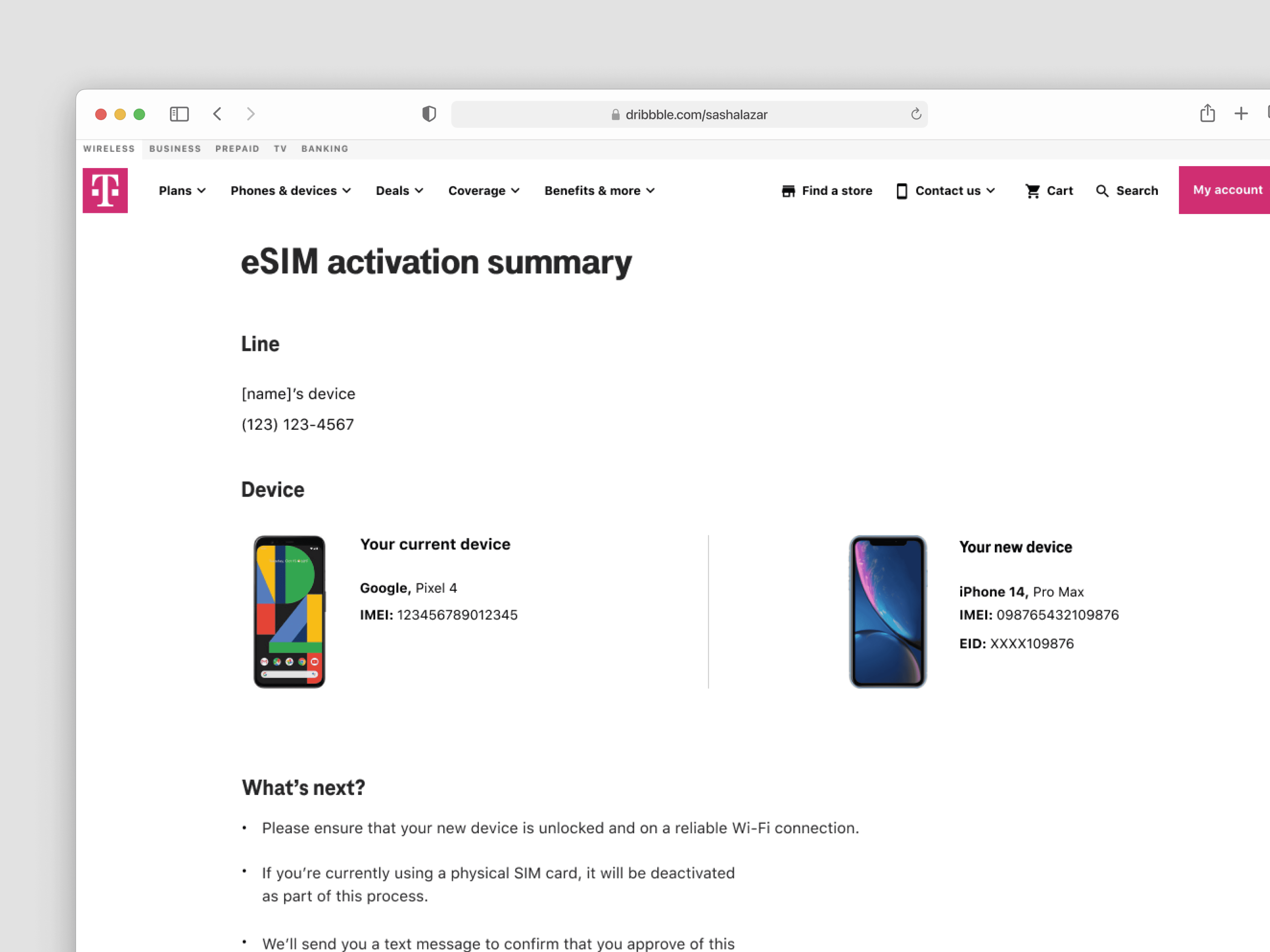
eSIM activation confirmation page a part of the MyTMO flow.
The Problem
The Problem
Users attempting to activate eSIM struggled due to unclear system feedback, fragmented steps, and lack of guidance during critical decision points. This led to:
High abandonment during IMEI entry and device verification
Increased reliance on customer support and retail assistance
Lost conversions for a high-value digital product
By addressing these pain points, we could reduce failure, build confidence, and increase completion rates for this new technology.
My Role
Design Collaboration
I worked as a UX Designer on this project at T-Mobile, splitting design responsibilities closely with a senior designer across the eSIM onboarding experience.
Cross-Functional Work
I collaborated with a copywriter, UX researchers, and the product owner to align on messaging, validate decisions, and ensure the experience addressed real user pain points.
Experience Design Contributions
I contributed to user flows, interaction design, and content structure focused on simplifying the process, reducing friction, and improving user understanding throughout activation.
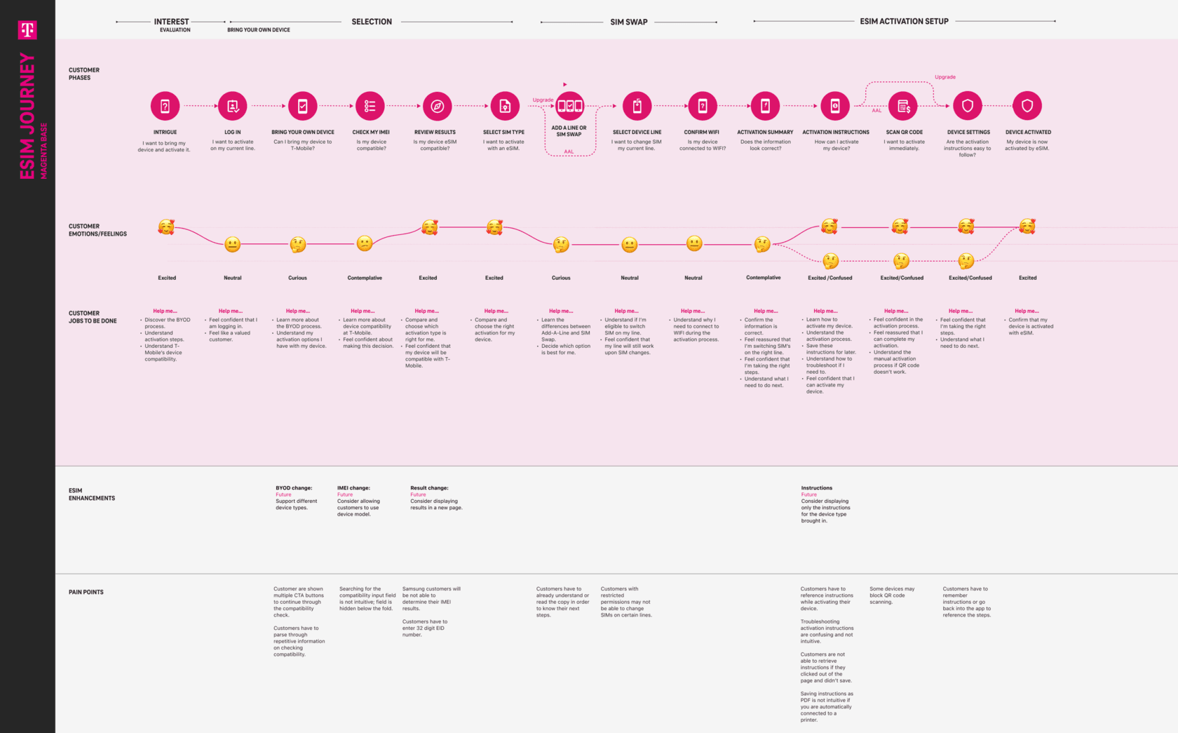
Screenshot of a user journey map illustrating key pain points and opportunities across the BYOD new customer experience.
Understanding the Problem
Understanding the Problem
Critical Confusion Around eSIM
Users were unfamiliar with eSIM and how it worked, leading to hesitation or errors during activation.
Multi-Step Friction
The process required navigating multiple pages with inconsistent feedback, which increased cognitive load and uncertainty.
Lack of Contextual Guidance
Technical terms like IMEI and EID weren’t explained in plain language, leaving users unsure how to proceed.
Defining the Opportunity
Defining the Opportunity
Improving adoption required more than simplifying screens. We needed to:
Reduce friction at key drop-off points
Make technical concepts easier to understand
Provide clear feedback during critical interactions
This reframed the problem from:
“Improve the eSIM experience.”
To:
“Reduce uncertainty during activation to increase completion and confidence.”
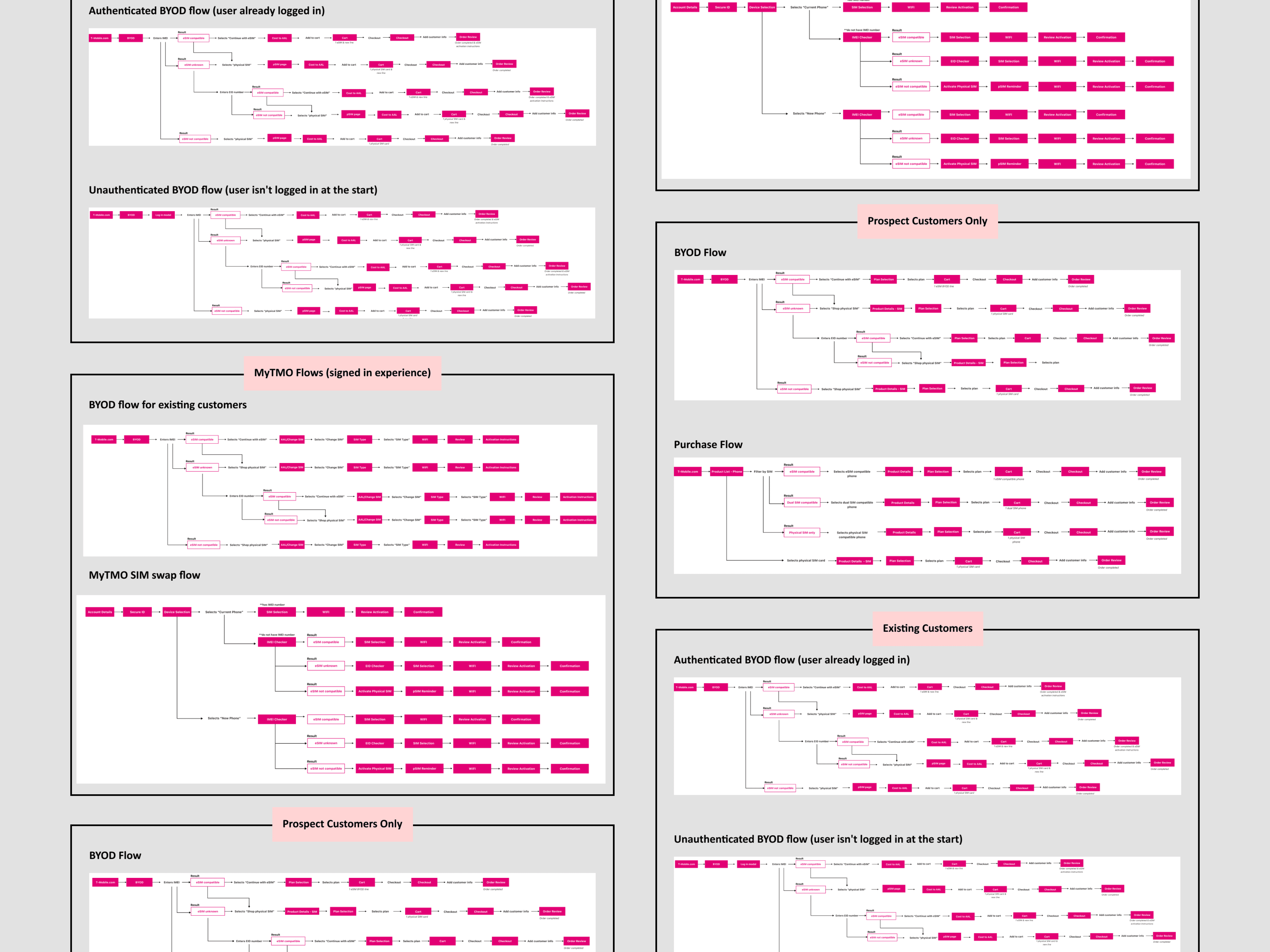
The different user flows we created for this project. Covering BYOD, MyTMO, and purchase flow. Screenshot of the BYOD new customer experience we tested with users.
Key Decisions
Key Decisions
Simplifying Critical Steps
The IMEI input step was a major drop-off point. We rewrote technical terms, explained how to locate an IMEI, and adjusted the button hierarchy to reduce errors while maintaining speed. User testing confirmed these changes increased confidence and understanding.
Embedding Education Contextually
Rather than relying on separate instructions or pages, we integrated guidance directly into the flow. Inline tips and modals helped users understand eSIM technology at the moment they needed it, reducing hesitation and reliance on support.
Streamlining Multi-Page Flows
The original process spanned multiple pages, with different teams owning sections, creating uncertainty for users. We minimized unnecessary steps, clarified next actions on each page, and provided visual cues to reduce cognitive load, effectively guiding users toward completion.
Testing and Iteration
Remote unmoderated usability sessions and a survey with 15 participants informed copy, hierarchy, and interface adjustments. Feedback consistently highlighted that the experience felt clearer, easier to follow, and more confident to complete.
Designing Within Constraints
We developed solutions that worked within backend limitations and SEO requirements. For example, we used inline guidance and modals to simulate a more linear, step-by-step experience without requiring changes to other teams’ pages.
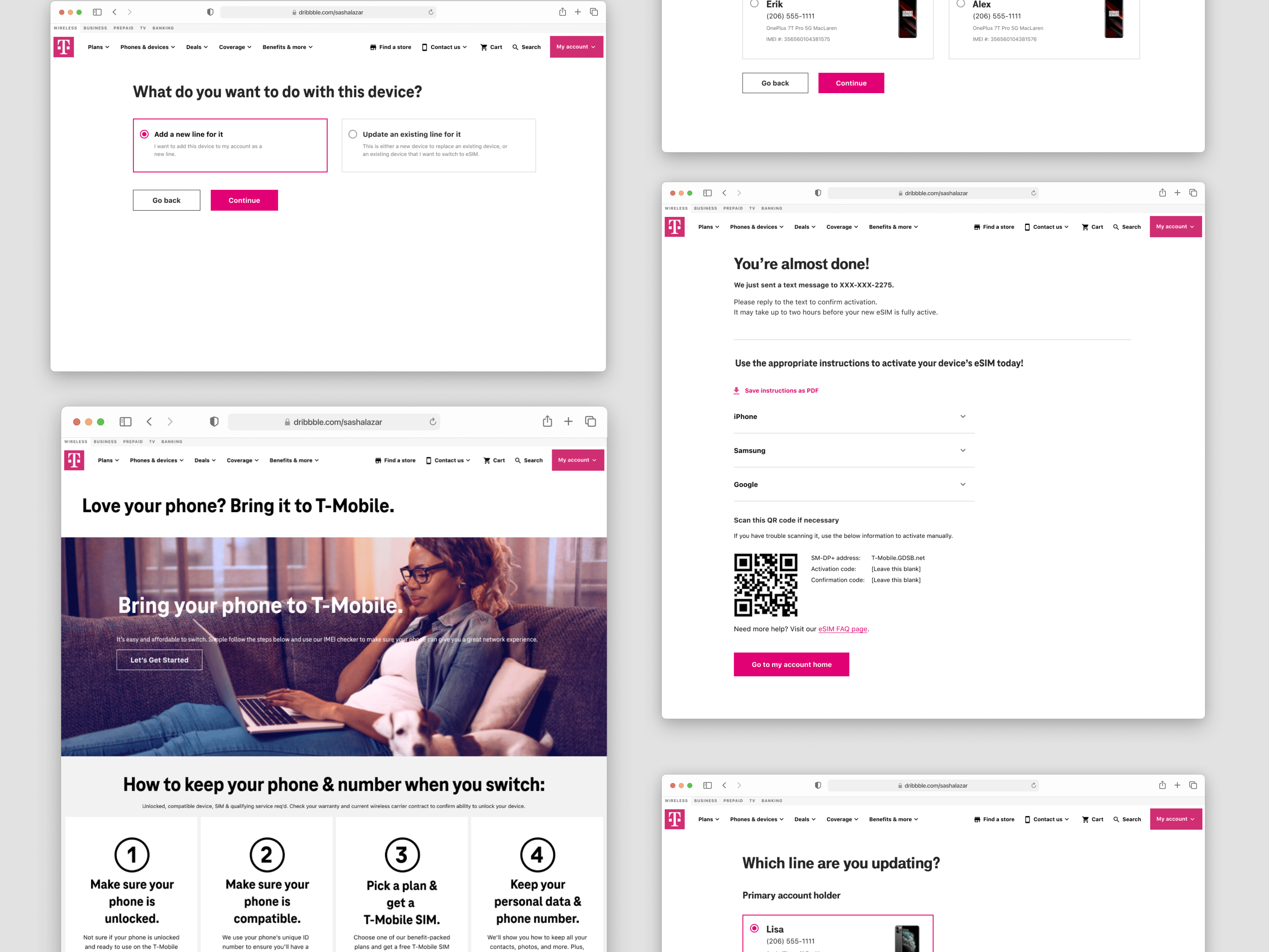
Add a new line or update current line page, BYOD page, Activation instructions page, Line selection page.
Outcome
Outcome
eSIM awareness increased by 50 percent
Customer adoption rose by 75 percent
Satisfaction with SIM features reached 81 percent
eSIM activations increased by 87 percent
These outcomes reduced dependency on support channels, increased adoption of a lower-cost digital solution, and improved first-time user success.
What This Means for the Business
What This Means for the Business
Lower dependency on customer support and retail activation
Increased adoption of a lower-cost digital solution
Improved first-time user success, supporting retention and long-term engagement
Lower dependency on customer support and retail activation
Increased adoption of a lower-cost digital solution
Improved first-time user success, supporting retention and long-term engagement
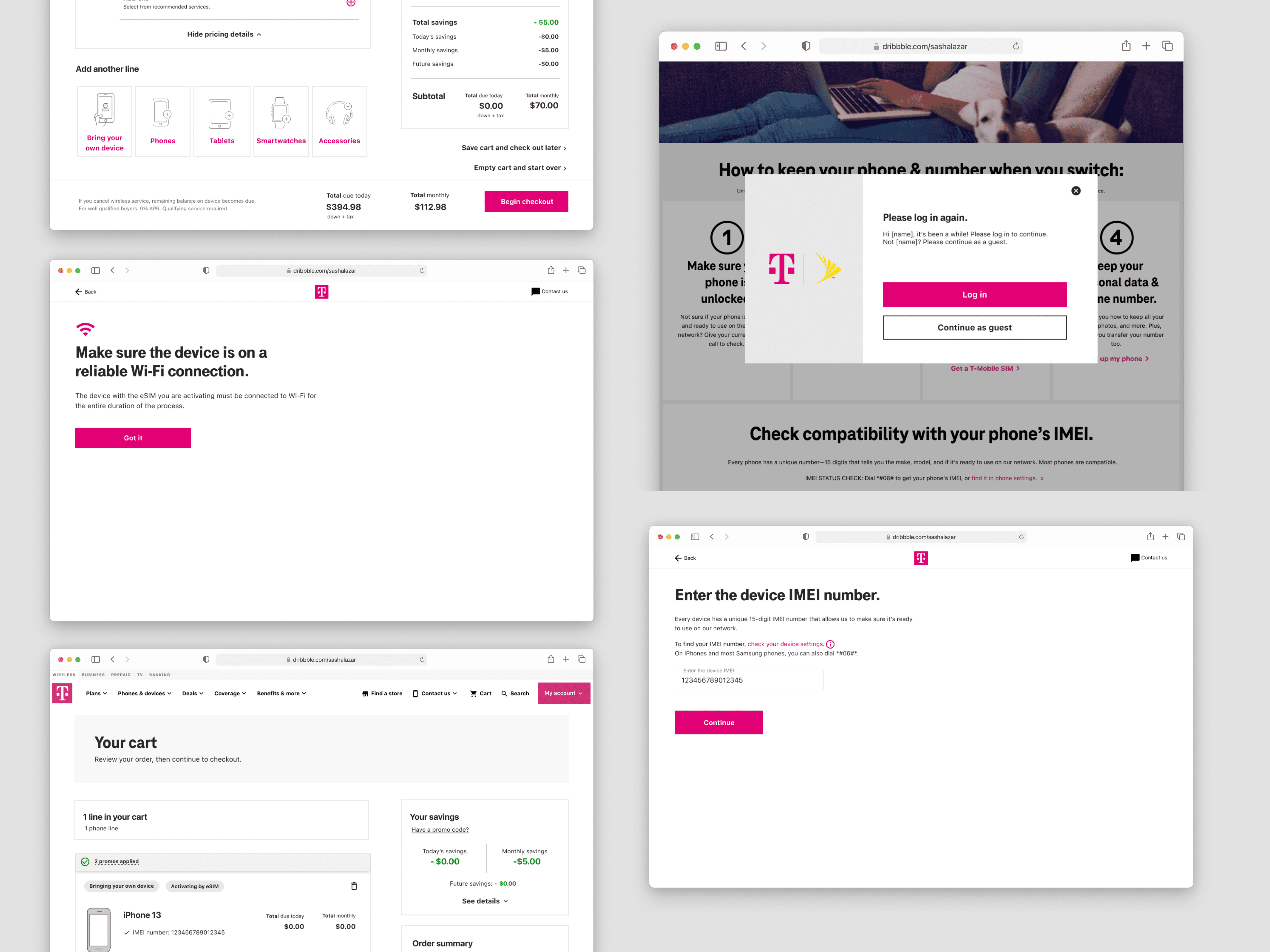
Cart page, Wi-Fi connection confirmation for eSIM activation page, Log in modal for BYOD experience, MyTMO IMEI number page.
Reflection
Reflection
The most impactful shift was focusing on reducing uncertainty rather than adding more instruction.
By addressing confusion at the exact moments users needed clarity, we were able to improve both completion and overall confidence in the experience.
If I continued this work, I would explore:
Personalization based on device compatibility and user context
More proactive guidance during edge cases and failure states
Further simplification of the activation process as backend constraints evolve
Next Steps
Next Steps
We began designing a major refresh to transform the eSIM activation process. The goal was to move from a multi-page flow where users often felt uncertain about what to do next to a more guided, linear experience tailored to each device type.
Some aspects of the existing flow were outside our control because other teams owned certain pages or sections, but we progressed with a stepper-based design intended to reduce user friction and improve clarity.
I cannot share the details due to an NDA and because the redesign has not yet gone live.
During this project, I was embedded at T-Mobile from my design agency, WongDoody, working closely with the internal team to execute the redesign. My contract ended around the same time the project was put on hold as I returned to WongDoody.